Portfolio:ProjectsBrandsCodes
HI 🥳! Here you can explore my professional projects: highlights, client work, and deeper looks into the research, building, and production behind each piece. I hope it gives you a clear sense of what we can create together.
Check out this cool projects!
You could be here too! and for a GOOD price!


Project 001
The making of Koyote,From Concept toIdentity.
- Our concept
- Color Palette
- Logo
Where does it start?
Koyote is my personal creative project, where I combine what I have learned throughout my university career in Business, Marketing, and Game Theory with my deep personal passions for coding, illustration, and, most importantly, creative flexibility.
I believe that, for both myself and Koyote, the essence of good work comes from flexibility, growth, and the desire to change. Being experimental and learning as a project is assembled is the key to creating something functional, aligned, and sustainable.
I align deeply and personally with Koyote, and I hope that this alignment can meet you.
The mentality
My small team and I address project challenges by being boldly experimental without being chaotic. We agreed to approach each project the same way we explored and completed our favorite video games: with curiosity, strategy, and a weirdly huge amount of research.
Our team’s key pillars are:
• Creativity
• Game Theory, for strategic solutions
• Business acumen, after all, that is why we got these degrees
• Human interaction above all
Our goal is to create projects that are sustainable, and to ensure that every handshake, virtual or in real life, leaves a lasting impression of friendship.
Goal
Our final Goal with you is to deliver a project that meets the German standard of technical expertise, Strategy and Implementation without losing our Latin American roots deeply embedded in bold creative expression.
You should check the Blog area to see our creative expression at the fullest.


Visual System
Color Palette.
Black
Base background
Charcoal
Depth layer
Ice White
Main text
Cyan
Primary accent
Cyan
Glow
Glow / active state
Electric
Blue
Orbit shadow
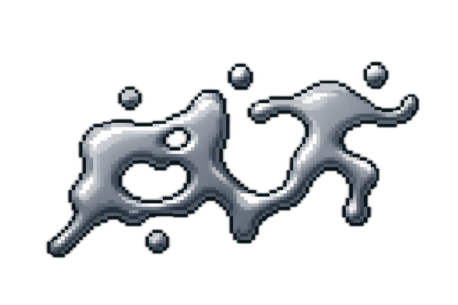
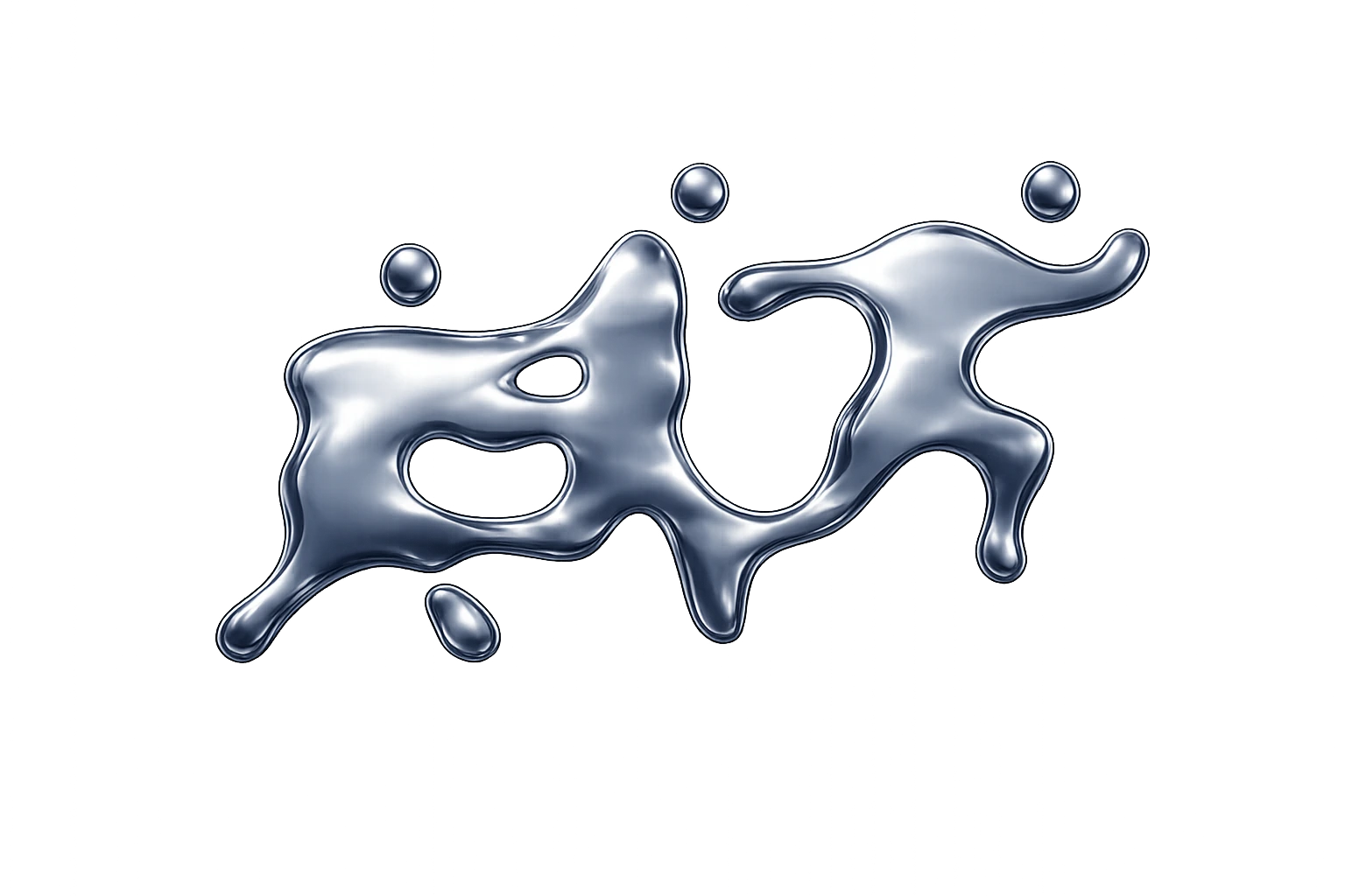
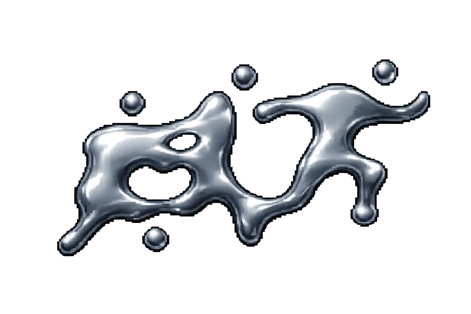
Logo Meaning
Logo
The KOYOTE logo represents help as the foundation of growth. Its three human silhouettes show a person moving forward through different phases of development. Each step symbolizes progress, transformation, and evolution.
The core idea is that growth does not happen alone. We move forward by helping others, and through helping others, we also help ourselves.
Core Message
KOYOTE stands for the belief that goals are achieved collectively, not individually. Each silhouette marks a phase of movement, showing that personal and creative growth is a process. The final message is simple: we grow when we help, and we help because growth is shared.